


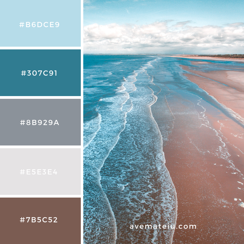


Texture and Pattern.
Texture is often overlooked in interior design. Yet, it can convey mood and style and create more interesting interior.
Texture is a surface quality of a material it can be experienced by touch (tactile texture) and when looking at it (visual texture).
Tactile texture is produced by the physical surface texture (the relief) of a material – a surface can feel smooth, soft, hard, rough, ridged, grainy or bumpy to the touch. The play of light on the peaks and valleys of an innately textured surface creates highlights and shadows which enhance the visual texture.
Visual texture (sometimes called illusionary or simulated texture) can be produced by colour, or by pattern. A particular surface can be made to appear quite different to the way it feels to the touch: smooth surfaces can have visual textures, small pattern can be ‘read’ as texture, and a faux finish can imitate other materials such as wood, brick, marble, silk or stone.
Texture can be just as important as light and colour. Soft red pillow would convey much different emotional response to a brick – red wall.
The key to using texture and pattern is harmony and taking to the count all of the other design elements. By incorporating balanced textures and patterns designer can create desirable moods and places.
Texture influences how light is reflected form the surface therefore also the appearance of colour. Smooth, polished surfaces reflect light well, attract the attention, and make colours appear lighter and more intense; rough and matt surfaces absorb light unevenly so their colours appear darker. Contrasting textures are more prominent – that is to say, subtle textures appear finer next to coarse textures and coarse textures appear more dramatic next to fine ones.
n the same way as horizontal, vertical or oblique lines direct the gaze, textures with a directional pattern or grain can be used to make surfaces appear wider or taller. Coarse textures can also make objects appear closer, reducing their apparent scale and increasing their apparent ‘weight’. Finer textural patterns, when viewed from a distance, appear smooth, and distance appears to smooth even coarser textural patterns to a degree.
Texture also has other sensory impacts so textures should be appropriate to their intended use – soft upholstery fabrics are pleasant to touch, coarse ones can be uncomfortable and sleek ones can feel slippery and cold. Texture also affects the acoustics of a space – uneven and porous textures absorb sound, while smooth surfaces reverberate and magnify it.
Upkeep is also a consideration in textural selections. Smooth, flat surfaces show dust and fingerprints, but are easier to clean and maintain, while uneven surfaces, such as deep carpet pile, conceal dirt but are harder to clean. Smooth surfaces with visual textures combine the best features of both – they conceal dirt and are easy to clean.
https://interiordesignstudent.com/2018/05/31/understanding-texture-in-interior-design/
Perception of Space
Lighting is another crucial element when designing a space.
Spaces with large windows, glass doors, or skylights can let in a lot of natural light, which leads to the sense of greater area. Light-colored interiors also add to the effect. And as for mirrors, if you don’t have the luxury of large glass windows and doors, you can use them to increase the perception of space.
Some spaces are harder than other, because they don’t have as much of natural light to play with. A simple trick to use is to install a mirror to optically enlarge the room and use natural warm light bulbs.
Artificial light helps to create a visual stimulation. Human eye is naturally drawn to the brightest point of the room. Therefore, light can be used to highlight a vocal point of a room and make a statement. On another hand dimmed light can create drama and add feeling of warmth to the interior.
As mentioned above light can have multiple options – to brighten the room up, decorative function, calling different emotions. Skilled designer will be able to use a mix of all of these and create great space.
Lighting is so important that it has its own specialists called light designer.
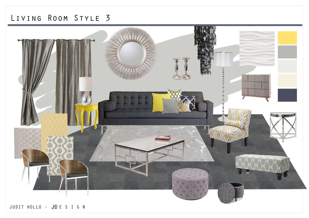
Colour in interiors
Colour is a powerful tool that could subconsciously play with our mood and desires. It’s widely used in advertising, branding and marketing, but also is a great tool when comes to interior design. Arguably colour of the surroundings has a bigger impact on our mood that any other factors of there interior.

Different shades conjure various emotions therefore when choosing a colour for a room in house, office or any other place first thing to consider is the atmosphere that is to be created and what colours could contribute to achieve this.
“Using colour is not necessarily for the faint of heart, but its ability to singularly and definitively create an experience makes it one of the most important and valuable tools in interior design,” says the designer, “I respond intuitively to the use of strong colour and appreciate the visceral response people have upon walking into a colourful room. I love the idea of total immersion in a singular pigment. To me, this idea of creating a cocoon of colour can elicit a multitude of emotions from relaxation to passion.” – Amanda Nisbet
PINK – often associated with a colour for girls bedrooms, pink is a delicate hue in colour psychology which speaks of nature and felinity. Tones of pink can be comforting when used well.
BLUE – Deep, bold hues, such as navy and royal blue, are great for evoking confidence and are associated with admirable qualities such as loyalty, trust, peace and success. Lighter shades of the colour instil a feeling of calm and tranquility at home which makes them great for bedrooms, bathrooms and living spaces where you want to relax.
BLACK – Black is the go-to colour of all time in all aspects of life. Whether you don’t know what to wear or what colour of furniture to opt for, black’s neutrality gives it a fail-safe quality and promises sleek sophistication.
PURPLE – Purple is associated with a wealth of wonderful emotions from depth and creativity to fantasy and nobility in colour psychology. It looks right at home in feminine spaces, such as this pretty bedroom scheme, but deeper versions of the hue can also be incredibly masculine.
YELLOW – It’s no surprise that yellow is connected with joy, optimism and energy in colour psychology. Whether it’s mustard, lemon or baby yellow, the hue is always unmistakably vibrant.Playful yellow shades make a perfect match for children’s bedroom and nurseries, but the colour can also be grown-up and works in practically any room you want it to.
GREEN – Green is an extremely positive hue as it stimulates thoughts of balance, growth and restoration in colour psychology. It immediately brings the natural world to mind and it’s an incredible way to bring a refreshing sense of nature indoors, especially if your home is located in a city with little surrounding greenery.
GREY – Grey is one of those versatile colours that can take on a range of personalities. The shade in colour psychology is thought to influence perceptions of security, intelligence and solidity.
RED – Timeless neutrals may be a firm favourite at LuxDeco HQ but we’re still in awe at daring colour schemes executed with class.Red is one of the more dramatic hues in the colouring book and one of the most enticing colours when it comes to rousing emotions. It’s often coupled with sentiments such as passion, excitement and energy.
BROWN – This living room scheme from Greg Natale firmly supports the suggestions that brown is linked to feelings of comfort and relaxation. The rich brown wallps combined with a corresponding sofa and cushion display is utterly inviting and summons thoughts of cosiness and companionship.
Major project – Psychology of interior design.
Throughout the pandemic we were spending much more time indoors than we would usually do. Many of us focused on redecorating their homes to create a safe, cosy and homey space where we can feel happy. The space we are spending most of our time is playing a major role in our psychological behaviour. There is a strong connection between people and their habitat. The colours, lighting, proportions, acoustic and materials used are addressing our senses in a way to feel certain way.
Dave Allan Kopec – professor at New School of Architecture in San Diego – states that there is subconscious connection that contributes to our emotions and and perceptions in a part of our brain responsible for reacting to geometry, space and colour. Interior design became an inherent part of people’s psychology.
Studies finds that depending on a working environment an individual placed their productivity, creativity and mood can vary. Workers stuck in small box room offices are not as productive as these who had a more spacious office with natural accents of plants or green colour (green colour proves to be relaxing).
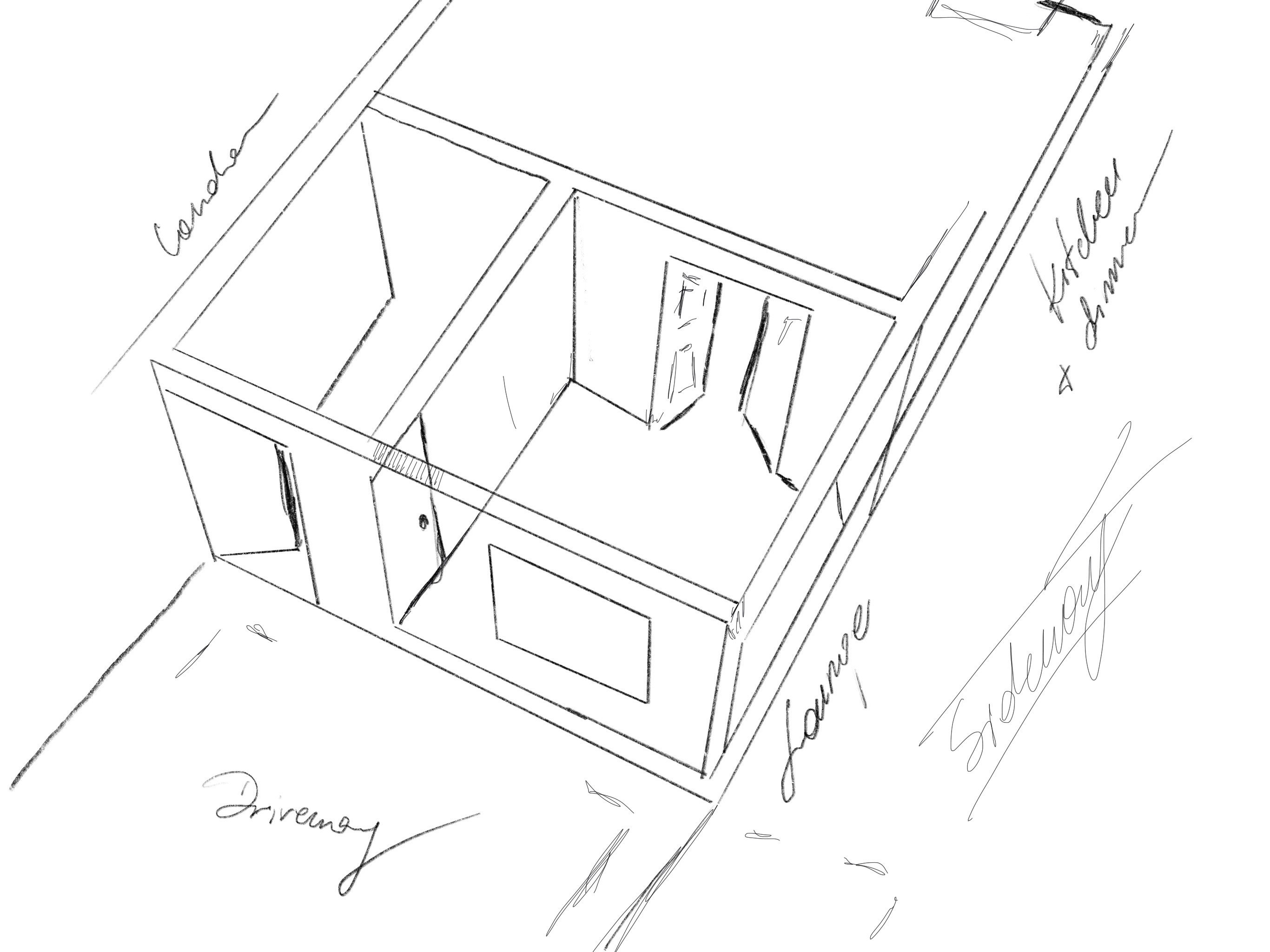
For my Major Project I would like to explore how people interact with interiors and how interiors interact with people.
I would like to focus on a house blank canvas and create mood boards for each room considering its purpose.


Lifer briefs – UK Greetings – choosing between briefs.
For part of the Major Project we are to choose from life briefs announced by D&AD and YCN. There is a variety of options and companies looking fro creative solutions to choose from. When reading through the briefs I realised that most of them are about creating a campaign, raising awareness or designing packaging. I don’t believe that skills I gained during my time of IVM studies is perfectly suitable to any of these. I also think that working on a campaign is not a single person job and cannot be completed within the timeframe we are given. Luckily, the last brief form UK GREETINGS seems to be perfect for an illustrator and is utilising my skillset into producing something commercial, yet thoughtful.
UK GREETINGS has invited students to design:
- 2x single greeting card
- 1x boxed notecard set
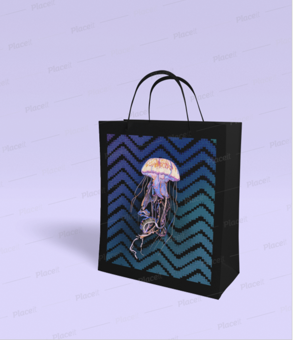
- 1x giftbag
- 1x pattern for a gift wrap
- 1x notepad cover
All of these should include different design, yet be coherent to create a commercial collection.
Things to consider:
- Are the cards going to be generic or for a special occasion
- I would rather design generic cards that can be used for any occasion, because they would be more universal and can be sold at any time without specific time (restrictions)?
- who is the customer
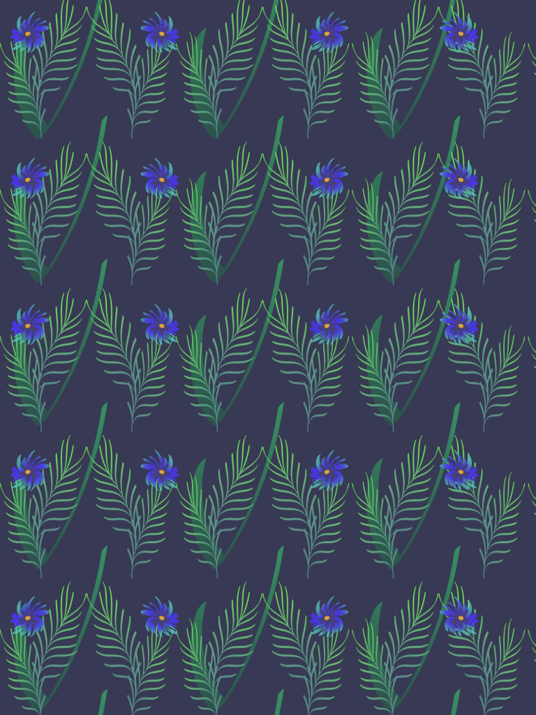
- I would like to target people with maximalist yet sophisticated taste. I could see these in Anthropology and Soho Home collections. Experiment with textures, deep expensive looking colours that work together.
- what is the colour palette I will use
- I will use Dark Bottle Green, Powdery Pink, Dark Blue, Greys and would love to experiment with a writing in copper using foil heat transfer.
- name for the range
- Still to be discovered

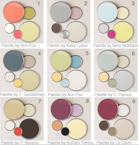
Colour palette.
Colours were lifted form Farrow & Ball pigments collection in collaboration with Natural History Museum.


When using these colours inspired by Natural History Museum I think I could build my project around NHM as well and get my inspiration from there.
There is so much to be inspired from in NHS – The architecture, the collection of botanicals, animals, skeletons, minerals etc.
Due to COVID-19 pandemic the binding is closed at the moment, however I have few books and catalogs from the Museum in my collection to work from at the moment. Hopefully once the restrictions are lifted I will be able to go and pay visit to research 🔬 🧐
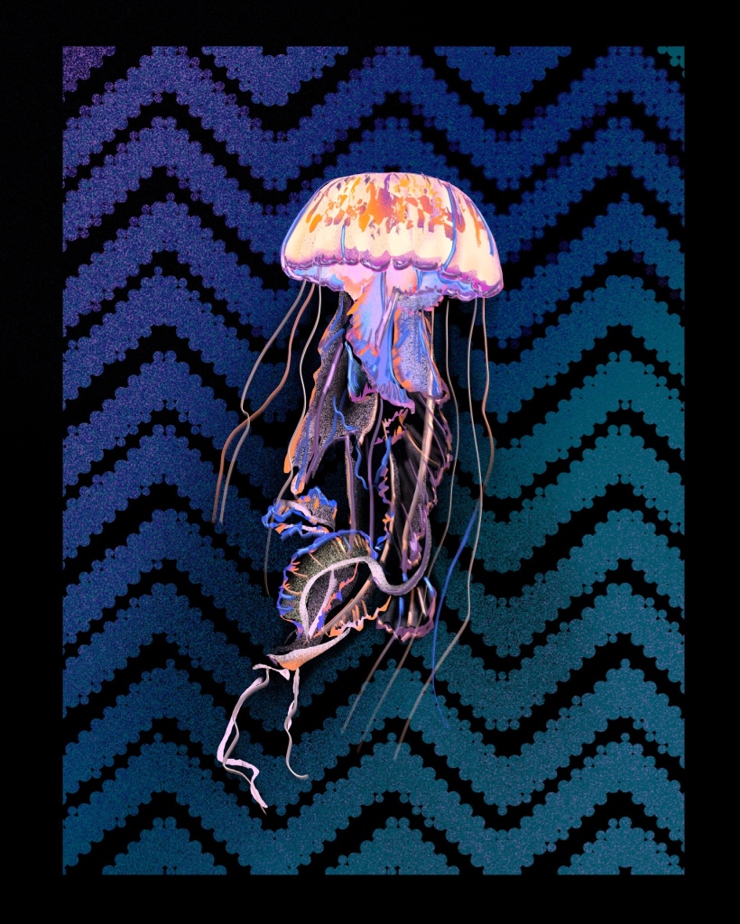
Inspiration and example of bold patterns and textures working together with an illustration when well considered

Postcard design by Divine Savages.
